Visual Data of a Relationship Over a Year
My roommate and I were discussing about how we should create a webapp that tells you who is the better boyfriend/girlfriend in a relationship. This reminded me of a reddit post by /u/Prometheus09. Inspired by what he did with his Whatsapp data, I decided to do the same thing using my Skype logs.
My last relationship went from November 2013 to April 2015. Unfortunately my Skype logs start from March 2014, so I’m missing about 4 months worth of data. Still, I had fun doing this and it gave me some insight into our relationship. Here is a relationship in 200,000+ messages over the course of 14 months worth of data.
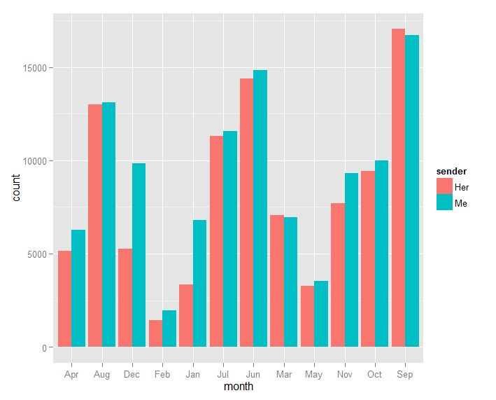
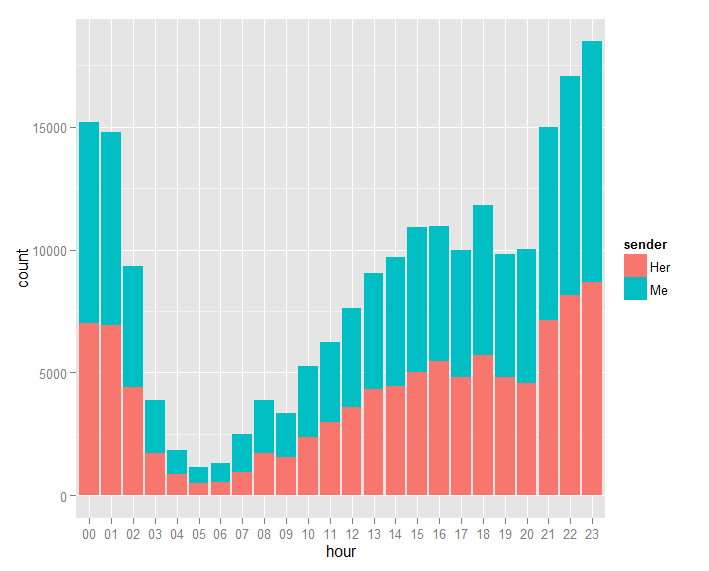
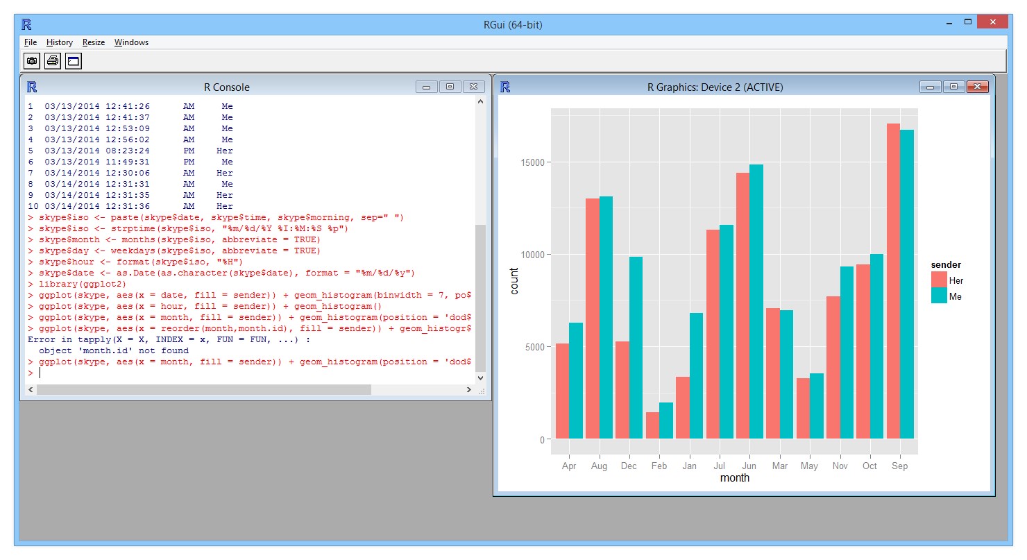
Since I don’t have much experience with R, I can’t figure out how to organize the months properly. I’ll fix it another day. From these graphs, our Skype conversations are very limited in the winter, going up in the spring, and we talk the most during summer. We also prefer to chat late night from 9PM - 1AM.
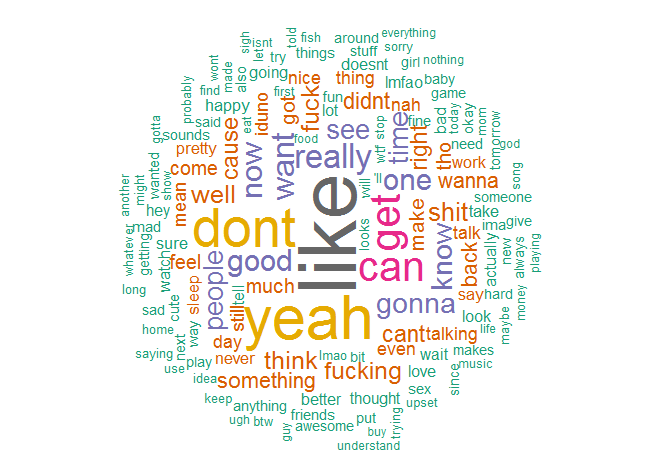
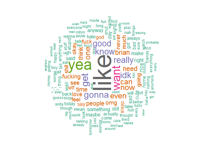
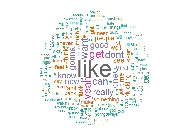
This was more interesting to me. First, “lol” and “just” were omitted because they dominated the cloud. Pronouns were also removed and words such as “the.” Unlike most relationships, the word “love” was hardly said. At least we got a good amount of “like” going on for us. My cloud has a lot more negative words associated such as “can’t”, “don’t”, “sorry”, and “whatever.” Her cloud has more positive words, and from our combined cloud, she says my name a lot more than I say hers.
At the moment, I don’t really know what I think of this data. I’m also missing Facebook messenger data and text messages. Also there’s the time we spend together in person, which is the most important part of a relationship. I just thought it would be interesting to visually look at this data and look into a relationship from a technical perspective.
How was this data obtained? I used R for everything. R is a functional programming language that allows you to explore data sets. I used the ggplot package to create my graphs, tm - text mining package to count my words, and the wordcloud package to create the cloud image. I also used Ruby to clean my Skype logs.
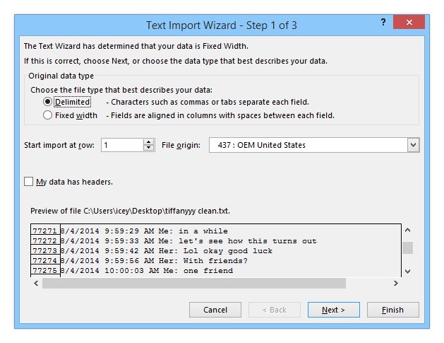
First, I used a Skype log viewer to export my Skype logs since Skype’s programming team decided storing conversations in regular .txt files wasn’t a good idea.
[1/18/2015 12:07:47 PM] Baby Tuna 🐟: My friends been waiting here an hour [1/18/2015 12:08:05 PM] Brian Choy 🌊: wait at the q50? [1/18/2015 12:08:09 PM] Baby Tuna 🐟: Yea [1/18/2015 12:08:12 PM] Brian Choy 🌊: should i come get you [1/18/2015 12:08:14 PM] Baby Tuna 🐟: No [1/18/2015 12:08:21 PM] Baby Tuna 🐟: It’s bad on the road
Great. I now have my logs. Now I have to change all my names to Me/Her. Unfortunately there was no way around checking for every Skype nickname we used and changing all the sender names. I also erased the brackets around the date.
1/18/2015 12:07:47 PM Her: My friends been waiting here an hour 1/18/2015 12:08:05 PM Me: wait at the q50? 1/18/2015 12:08:09 PM Her: Yea 1/18/2015 12:08:12 PM Me: should i come get you 1/18/2015 12:08:14 PM Her: No 1/18/2015 12:08:21 PM Her: It’s bad on the road
Now I’m ready to import this data into Microsoft Excel and convert it to a CSV.


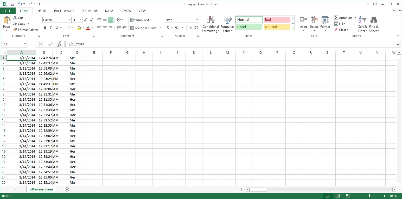
Afterwards I add a row on the top indicating that each column represents date, time, morning, sender.

Unfortunately some “corrupted” data leaks into other rows. Multi-paragraph text and copy&pasted conversations will result in garbage data. Rather than try to sift through all 200,000+ rows, I wrote a Ruby script to take care of this for me.
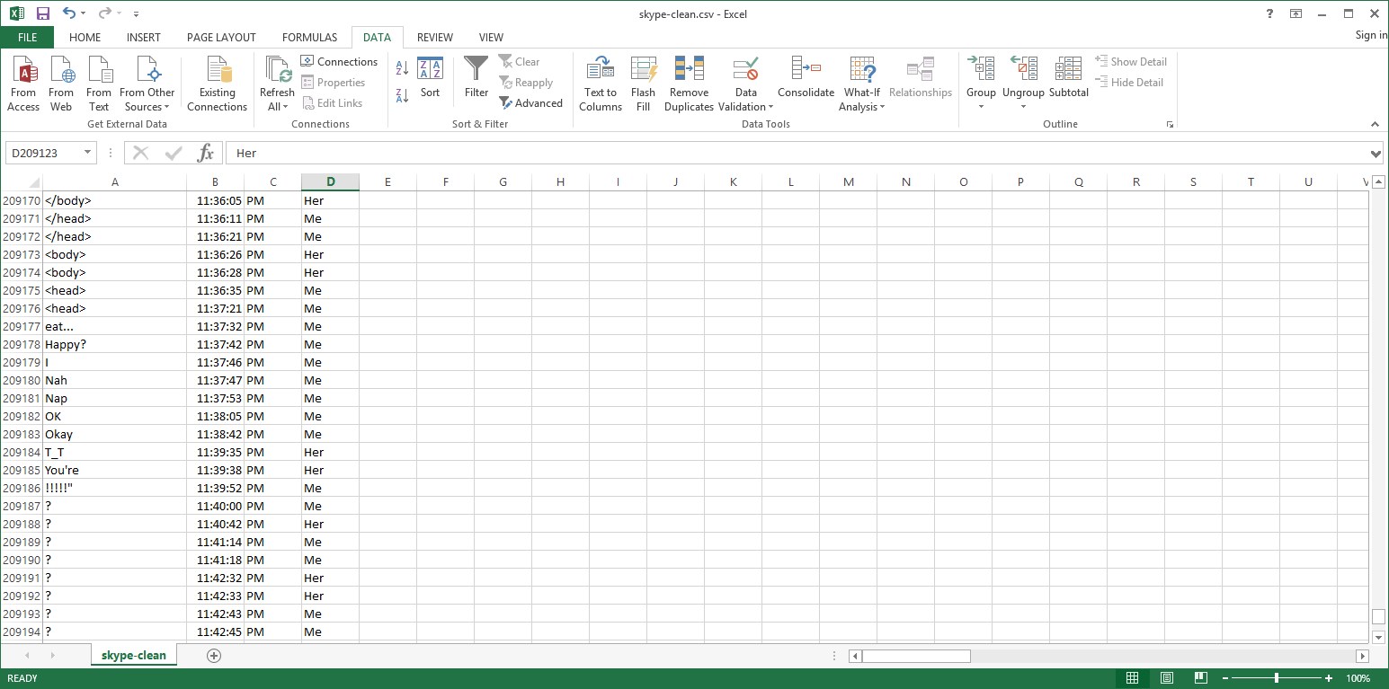
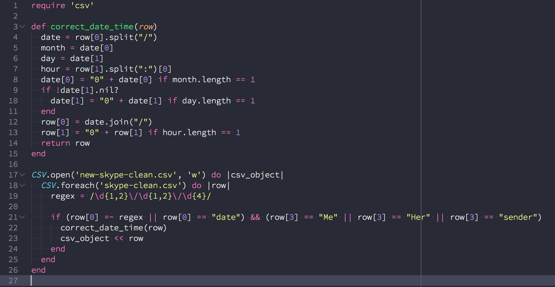
Here I verified each line to follow a valid format. If the row is valid, I write it to a new file.
Now I can open up R and plot out my data.
With the following code, I import my clean Skype CSV and plot my data for number of messages per sender in an hour.
skype <- read.csv("C:/Users/icey/Documents/skype-clean.csv", header = TRUE)
head(skype, n=10)
skype$iso <- paste(skype$date, skype$time, skype$morning, sep=" ")
skype$iso <- strptime(skype$iso, "%m/%d/%Y %I:%M:%S %p")
skype$month <- months(skype$iso, abbreviate = TRUE)
skype$day <- weekdays(skype$iso, abbreviate = TRUE)
skype$hour <- format(skype$iso, "%H")
skype$date <- as.Date(as.character(skype$date), format = "%m/%d/%y")
library(ggplot2)
ggplot(skype, aes(x = hour, fill = sender)) + geom_histogram()

Plotting messages per sender per month:
ggplot(skype, aes(x = month, fill = sender)) + geom_histogram(position = 'dodge')
With more exposure to R, I’m sure I can make a better visual representation, and be able to graph out more interesting information with the data I have. My attention is focused on Javascript right now, so I’m not diving too deep into R at the moment.
Following this tutorial made it easy to create the word graph. I cleaned up my original txt file with some Ruby code though to ensure accurate results.

Bam, a word cloud is generated:
library("wordcloud", lib.loc="~/R/win-library/3.2")
library("tm", lib.loc="~/R/win-library/3.2")
library("SnowballC", lib.loc="~/R/win-library/3.2")
lords <- Corpus (DirSource("C:/Users/icey/Desktop/temp"))
lords <- tm_map(lords, stripWhitespace)
lords <- tm_map(lords, content_transformer(tolower))
lords <- tm_map(lords, removeWords, stopwords("english"))
lords <- tm_map(lords, removeWords, c("lol", "just"))
wordcloud(lords, scale=c(5,0.5), max.words=150, random.order=FALSE, rot.per=0.35, use.r.layout=FALSE, colors=brewer.pal(8, "Dark2"))